
The Ultimate Guide to Pitch Deck Design: Everything You Need to Win Your Next Round
- Angelica Cifuentes
- Mar 12
- 5 min read

Investors see thousands of decks every year. Statistics suggest they spend an average of two to three minutes on a single presentation. If your deck looks like a standard template or a crowded word document, you have already lost their attention.
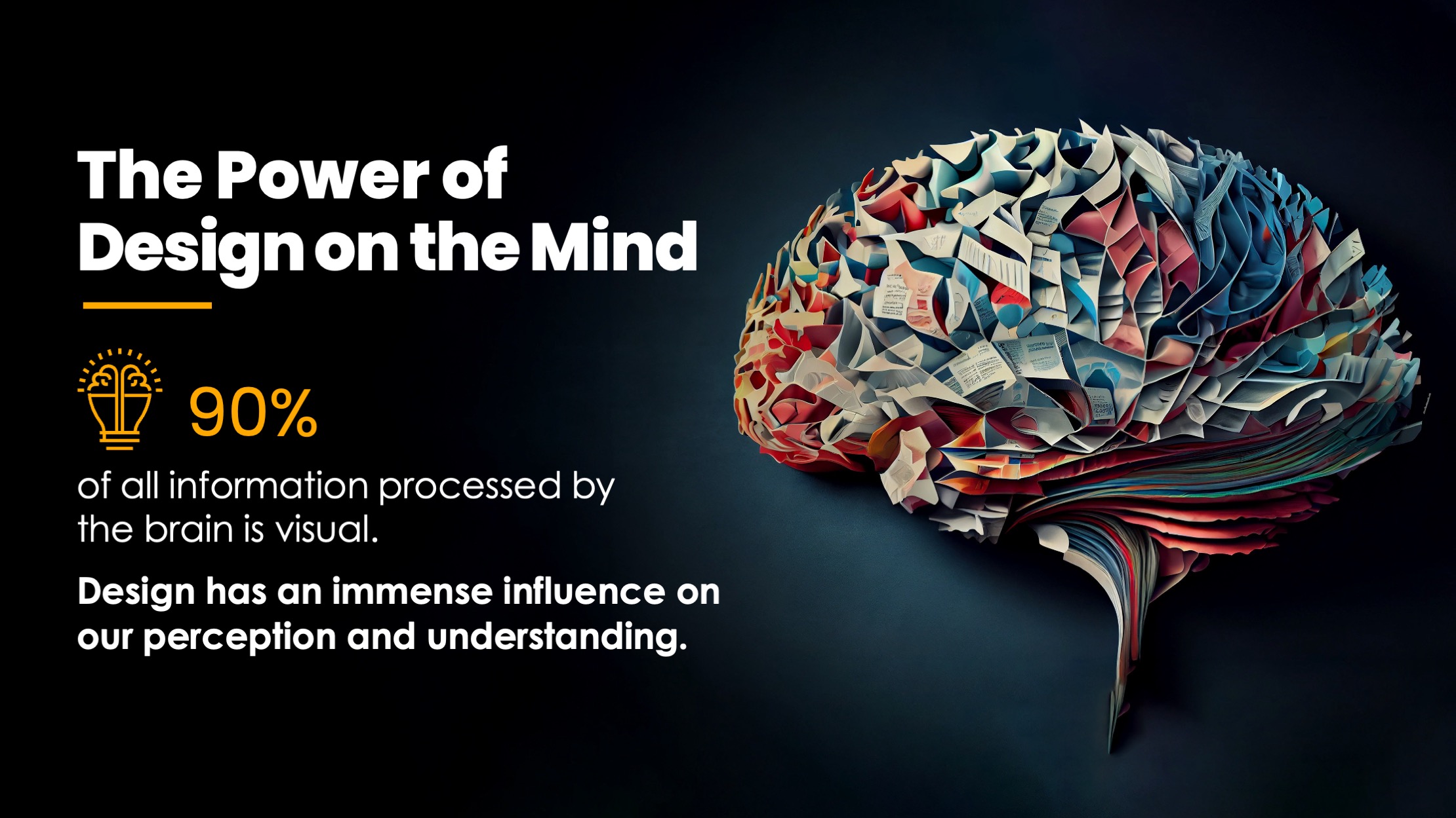
Design is not just about aesthetics. It is about cognitive load. When you are raising a round, you are selling a vision of the future. That vision needs to look like it is worth millions. At Presentora Designs, we believe a pitch deck should feel like a cinematic experience. It should be high-end, minimalist, and authoritative.
This guide breaks down how to approach pitch deck design to ensure your message lands with the impact it deserves.
The Strategy of the Narrative
Before you open any design software, you must nail the story. A winning deck follows a logical arc that builds tension and then offers a solution. The standard 10 to 15 slide structure is standard for a reason. It works.
You start with the problem. You make the investor feel the pain point your customers face. From there, you introduce your solution as the only logical answer. You then back that up with market size, traction, and a business model that shows how everyone gets paid.
The mistake most founders make is trying to fit too much information onto a single slide. If an investor has to squint or read long paragraphs, they stop listening to you. Aim for one core idea per slide. If you have three main points about your market, use three slides.
The High-End Minimalist Aesthetic
We advocate for an "Apple-style" approach to pitch deck design. This means stripping away everything that does not serve the message. In 2026, the trend has moved toward dark backgrounds with high-contrast elements.
A deep charcoal or "obsidian" background creates a sense of depth and prestige. It feels premium. When you pair this with bold yellow (#FFD600) accents, you create a visual hierarchy that guides the eye exactly where you want it. Use yellow for your "Ask," your most impressive growth metrics, or your call to action.
Avoid generic stock photos of people in suits shaking hands. They are forgettable and cheapen your brand. Instead, use cinematic and slightly surreal imagery. Think of monolithic structures, dramatic lighting, and vast spaces. This creates a "heroic" feel for your brand. It suggests that your company is a significant, permanent fixture in the market.

A cinematic, minimalist scene featuring a glowing yellow monolith in a dark, expansive space, symbolizing the power of a singular, well-designed business idea.
Visualizing Data for Decision Makers
Investors look for signals in your data. If your traction slide is a spreadsheet screenshot, you are making them work too hard. A professional pitch deck design services agency will tell you that data visualization is where most decks fail.
Use graphs, not tables. Use icons to reinforce metrics. If your user base grew by 200 percent, that number should be the largest thing on the slide. Everything else is secondary.
Consistency is also vital. Your fonts, line weights, and color shades must be identical across all slides. This level of detail signals to an investor that you are disciplined and attentive. If you cannot manage the details of a 12-slide deck, they may wonder how you will manage a $10 million series A.
When to Hire a Presentation Design Agency
There is a time and a place for DIY. If you are in the very early stages of a "friends and family" round or just testing a concept, a simple deck you built yourself might suffice.
However, you should not hire an agency if your product-market fit is still a total mystery. Design can amplify a good story, but it cannot fix a broken business model.
You should consider professional pitch deck design services when:
You are raising a Seed, Series A, or Series B round.
The stakes are high and the room is filled with institutional investors.
You need to translate complex technical data into a compelling executive summary.
You want to move faster and focus on your business rather than tweaking slide layouts.
Choosing to work with a presentation design agency is an investment in your company valuation. A polished, high-end deck signals that your company is professional, prepared, and operating at a high level.
The Value of Design Continuity
A common mistake is treating the pitch deck as a one-off project. In reality, your deck is a living document. You will have a version for a demo day, a version for a first meeting, and a more detailed version for the due diligence phase.
This is why we often suggest a retainer model for our growing clients. As your numbers change or your strategy pivots, your deck needs to evolve without losing its visual integrity. Having a design partner who understands your brand means you can get updates in 24 to 48 hours rather than starting from scratch every time you hit a new milestone.
Consistency across all touchpoints, from your pitch deck to your marketing materials, builds brand equity. It makes your startup feel like an established institution.

A high-contrast data visualization slide showing a "10x growth" metric in bold yellow typography against a dark, cinematic background with dramatic top-down lighting.
Key Design Principles for 2026
As we move further into 2026, several design shifts are becoming standard in the venture capital world.
Mobile-First Consideration: Many investors will first view your deck on a phone while traveling. Ensure your text is large enough to read on a small screen and that your layout works in a vertical scroll if necessary.
Modular Layouts: Use a grid system. It keeps elements aligned and makes the deck feel organized and intentional.
Cinematic Storytelling: Move away from "flat" design. Use depth, shadows, and lighting to make the slides feel three-dimensional.
Purposeful Animation: If you are presenting live, use subtle transitions to reveal information. Never use "bouncing" or distracting animations. The movement should feel as smooth as a high-end film transition.

A minimalist and slightly surreal team slide showing silhouettes of a high-performing team against a stark, illuminated background, conveying a sense of unity and strength.
Final Thoughts for the CEO
Your pitch deck is your most important sales tool. It is the bridge between where your company is today and where it will be after the next round of funding.
Do not let poor design be the reason an investor passes on a great opportunity. By prioritizing clarity, high-end aesthetics, and strategic storytelling, you position yourself as a leader who understands the value of excellence.
If you are ready to elevate your presentation and win your next round, you can see our work here or book a consultation to discuss your project. We specialize in turning complex ideas into cinematic, high-impact decks that get results.
Comments